Recently, my collegues and I went to IKEA from some serious dose of adult fun. Because lets face it, no matter how many times we’ve been, or how much we insist that we hate the swedish furniture store and its expertly, cunningly designed circuit that is guaranteed to spit you out with at least a WOK and a couple of lamp shades, we are all suckers for IKEA.
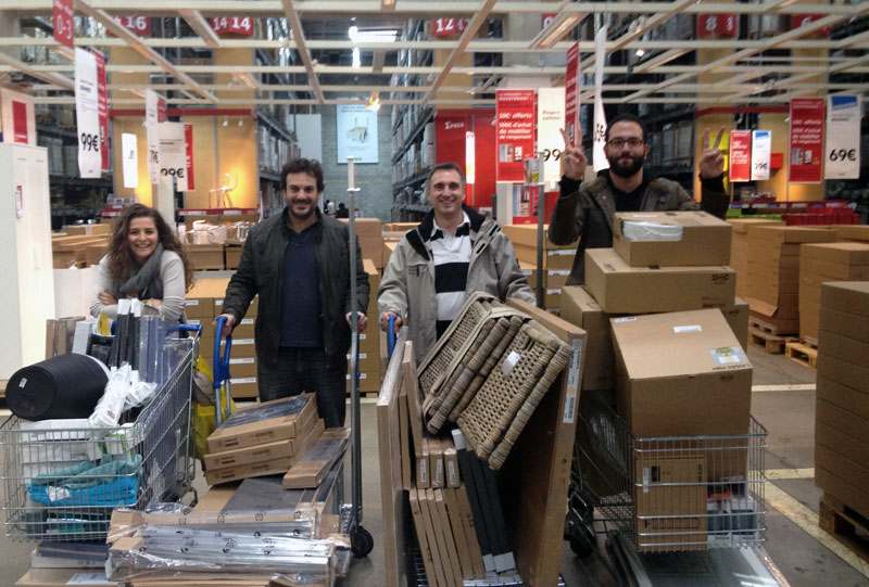
We went there prepared. We had preselected all the items we wanted to purchase on the website, printed out the list, twice, and rented an 8 cubic meters truck to fit everything in. It was supposed to be an in and out job. By 1 o’clock we had barely made it through the furniture section, despite my legendary organizing skills. We walked through the children’s section with an empty tummy and the prospect of spending another couple of hours arguing over which mugs we should take and how many lamps we needed. And then, lo and behold, the IKEA restaurant.
Courtesy of www.girlaboutotown.com
Evil layout
Lets take a second here to consider the genius of the evil IKEA master architect. I shall call him Lucas. IKEA stores are usually located in the suburbs of major cities. Access and land price are the main drivers behind that decision. What that effectively does is that people plan a trip to IKEA as an all-day activity. No one expects to spend one or two hours there, and no one ever does.
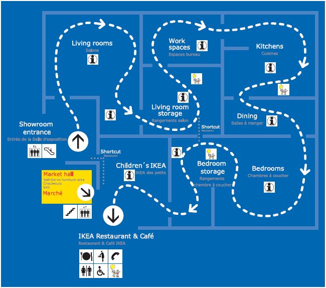
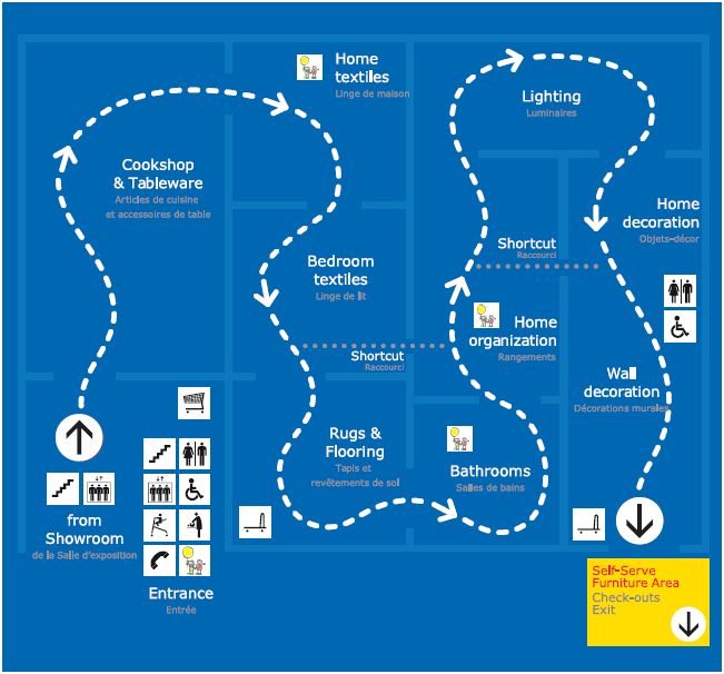
IKEA stores are usually very large blue buildings with yellow accents (also Sweden’s national colours) and few windows. They are often designed in a one-way layout, leading customers counter clockwise along what IKEA calls “the long natural way” designed to encourage the customer to see the store in its entirety (as opposed to a traditional retail store, which allows a consumer to go directly to the section where the goods and services needed are displayed).
Source: Wikipedia.org
As for the restaurant, by the time you get to it, you have spent the past couple of hours, going from one setting to another, projecting your lives onto the expertly laid out rooms. You have also argued with your friend/collegue/husband over the color of the EXPEDIT you are about to buy. Because lets face it, you could – always – use a little more storage space. If you have kids you have just walked through the kids’ furniture section, and they probably insisted on making you buy yet another stuffed snake. Everyone is tired, and hungry, and grumpy, but you can all agree on one thing: You could sure have some of those swedish meatballs.
Well, the folks of IKEA, that’s when/where they decide to casually place their modern, pretty, welcoming, friendly, *place pleasant word here* restaurant. Just before you have to (irrevocably) take the stairs down to the house ware / lighting / bedding / rug sections. And I can assure you it is no coincidence that the restaurant also has the first window you have seen in a couple hours, a large beautiful window, usually looking unto the parking lot trees.
If you think I am making this up, or that I am into conspiracy theories, check out what this UCL Bartlett School of Architecture professor had to say about it.
“Also you’re directed through their marketplace area where a staggering amount of purchases are impulse buys, things like lightbulbs or a cheap casserole that you weren’t planning on getting. Here the trick is that because the layout is so confusing you know you won’t be able to go back and get it later, so you pop it in your trolley as you go past.”
Source: Retailwire.com
Evil layout (continued)
The evil genius doesn’t stop here. IKEA restaurants are setup as a classic cafeteria. First you pick up a tray and cutlery, then get in line to pick the food items that you would like to have, from appetizer to desert. The food line is outlined by a metallic bar, which serves a double purpose. On one hand, it helps organize things and make sure no one (especially not one of those sneaky Lebanese) bypasses the line. On the other, its a good way of keeping you in the queue long enough to make sure you do end up taking more plates off the rack than you can really eat.
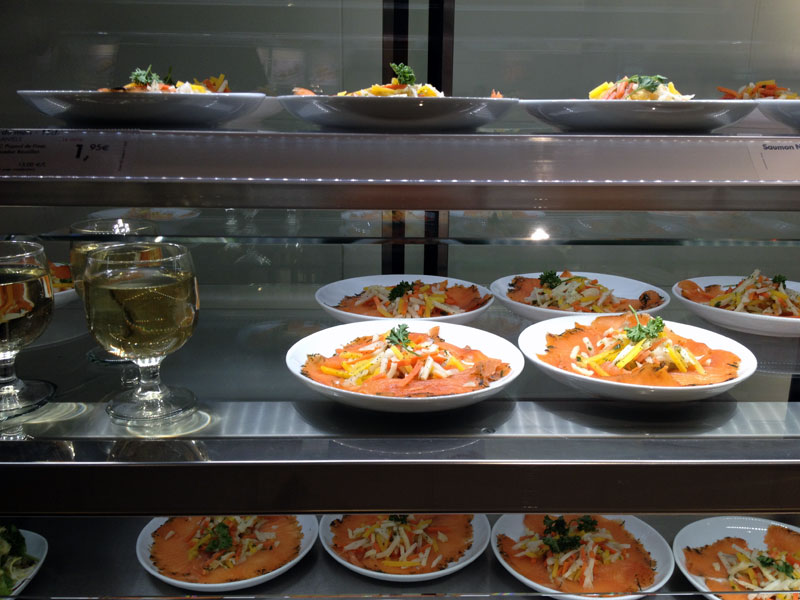
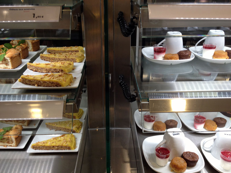
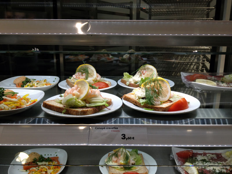
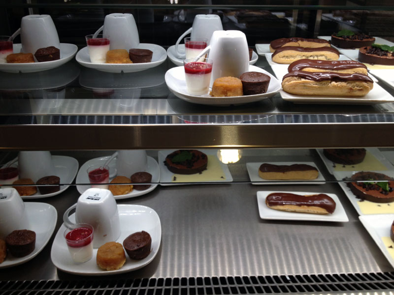
The racks are also part of the gimmick. They are slightly tilted so that a new plate replaces the one you just picked up, making sure there’s plenty for everyone, at least long enough for the industrial kitchen to spit out a giant refill. They also happen to be expertly lit. The ambient light makes the relatively well presented food look beautiful, with strong saturated colors. All in all the whole thing is rather photogenic.
The food
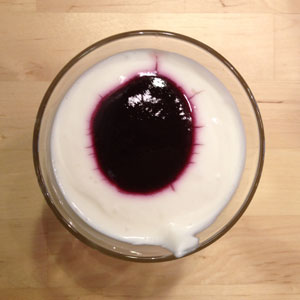
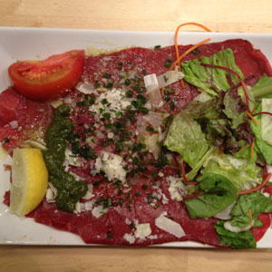
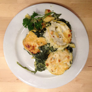
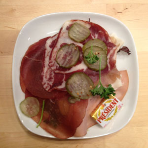
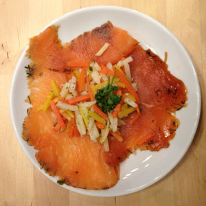
If IKEA’s furniture mated and had edible babies, this is what they would look and taste like. What I mean to say is the food is well presented. It corresponds to all our expectations and then some. It’s colorful, modern, it would impress our mother in law, but of course it isn’t worthy of a Michelin star. Everything we had was yummy and fulfilling (except for that weird looking white pudding with a blob of jelly for desert. Who came up with that one?). IKEA also won some grades with me for having at least 3 preparations for the salmon (herb smoked – Thinly sliced | Smoked – Fat chunk | poached). It was almost like a déclinaison.
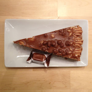
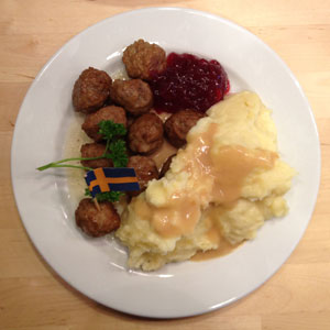
The meatballs are served with a type of grape jam which earns it my seal of approval (check out my burger with strawberry jam recipe to find out why). Some people would even be willing to drive for 2.5 hours to get their hands on some of those swedish meatballs. The Daim cake is always a winner with everyone (recipe here). But the best thing about the meal is the bill. A full meal, complete with appetizer, warm plate, desert, a drink and coffee will set you back no more that 15 euros.
The result? Happy customers with full tummies and even fuller shopping carts.
